Client Brief
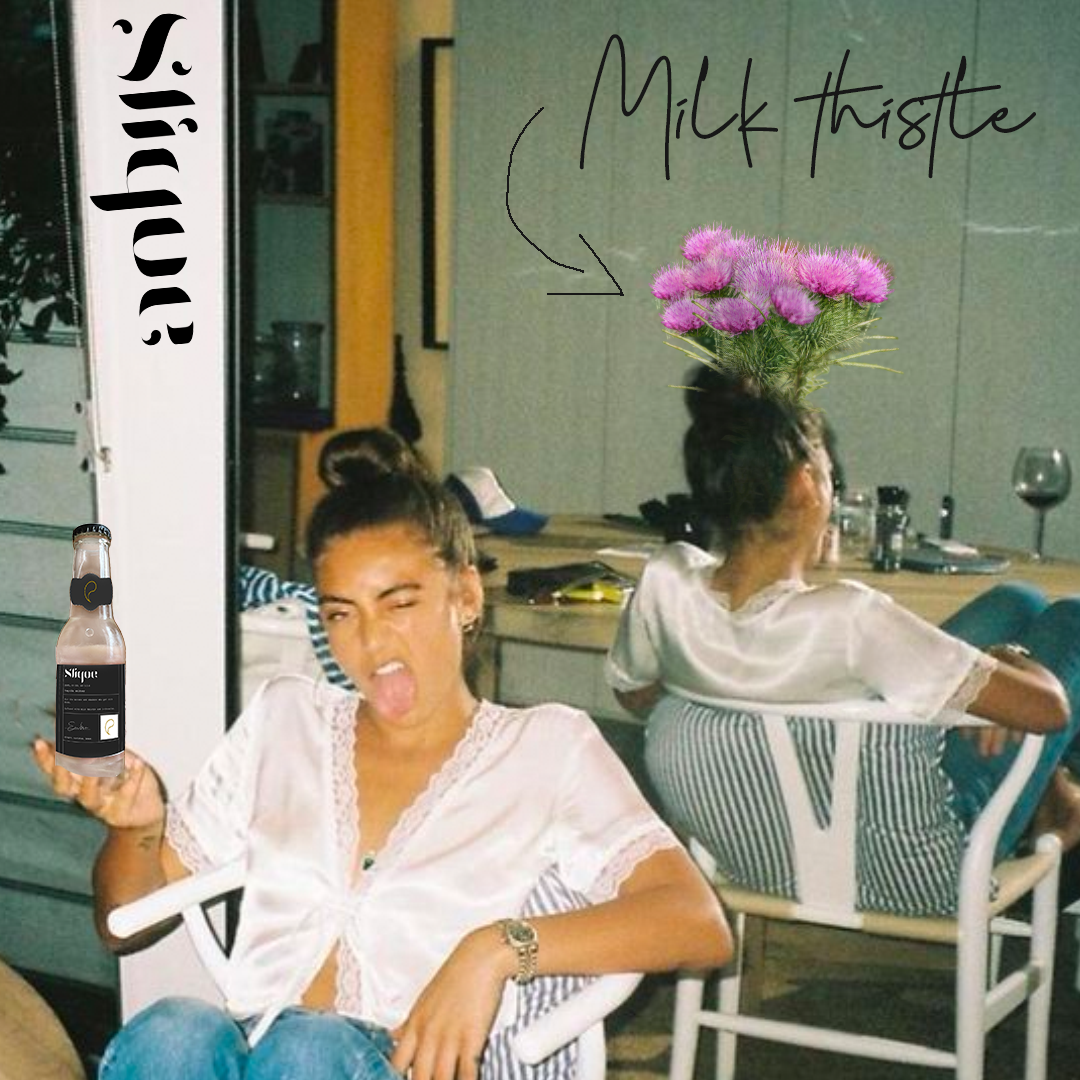
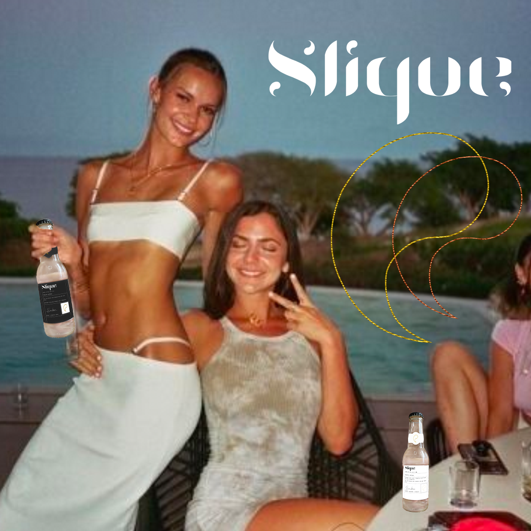
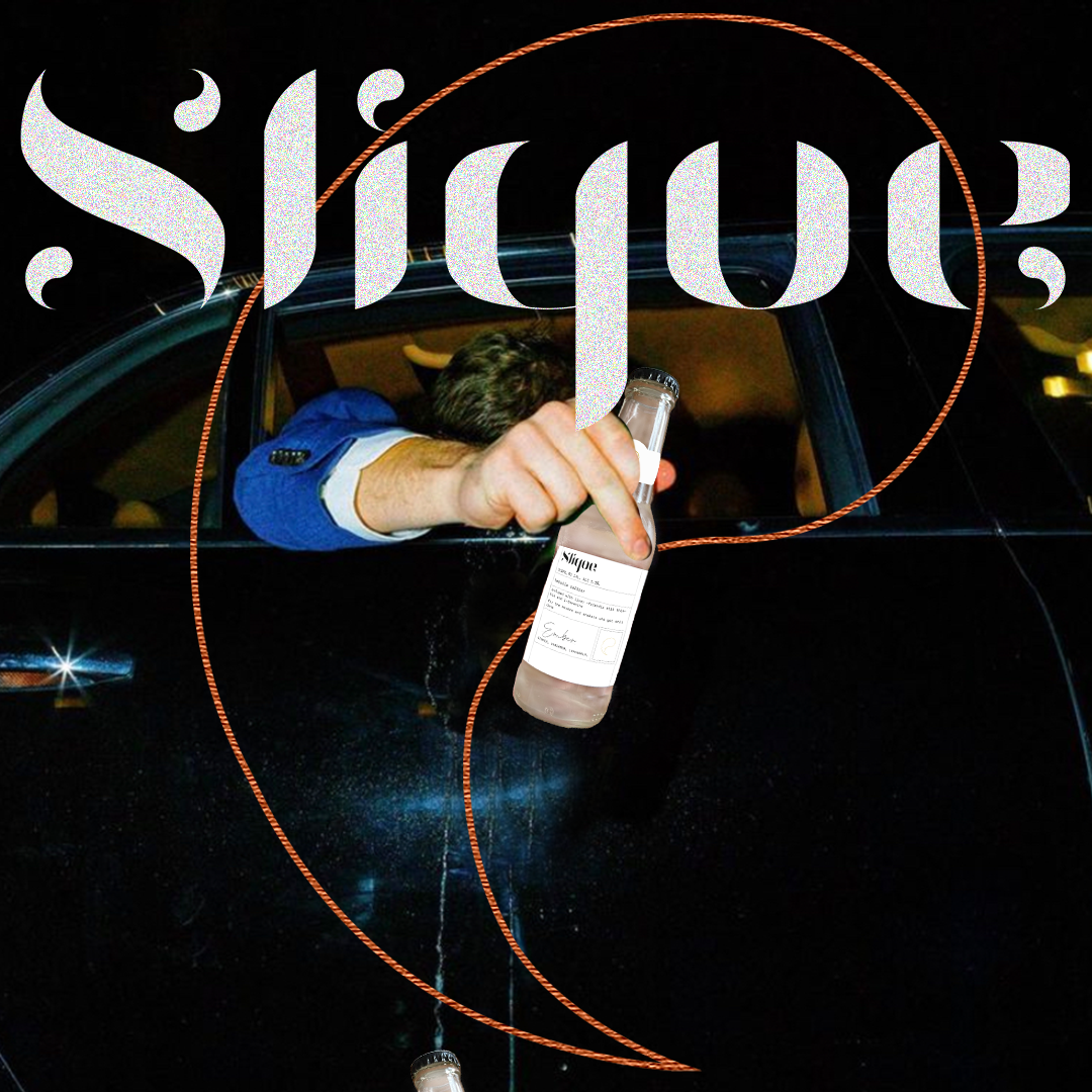
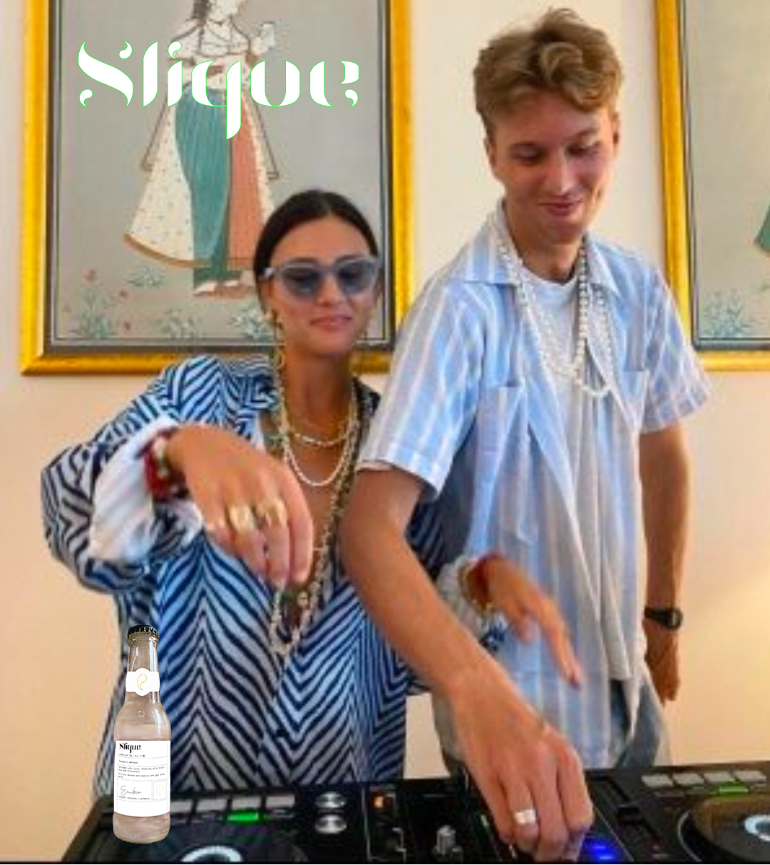
SLIQUE’s founder Holly came to us looking for a brand identity and brand strategy for a delicious tequila seltzer infused with liver-loving properties such as milk thistle and L-Theanine. SLIQUE is for the movers and shakers who wish to alleviate the compromises associated with drinking.
The Transformation
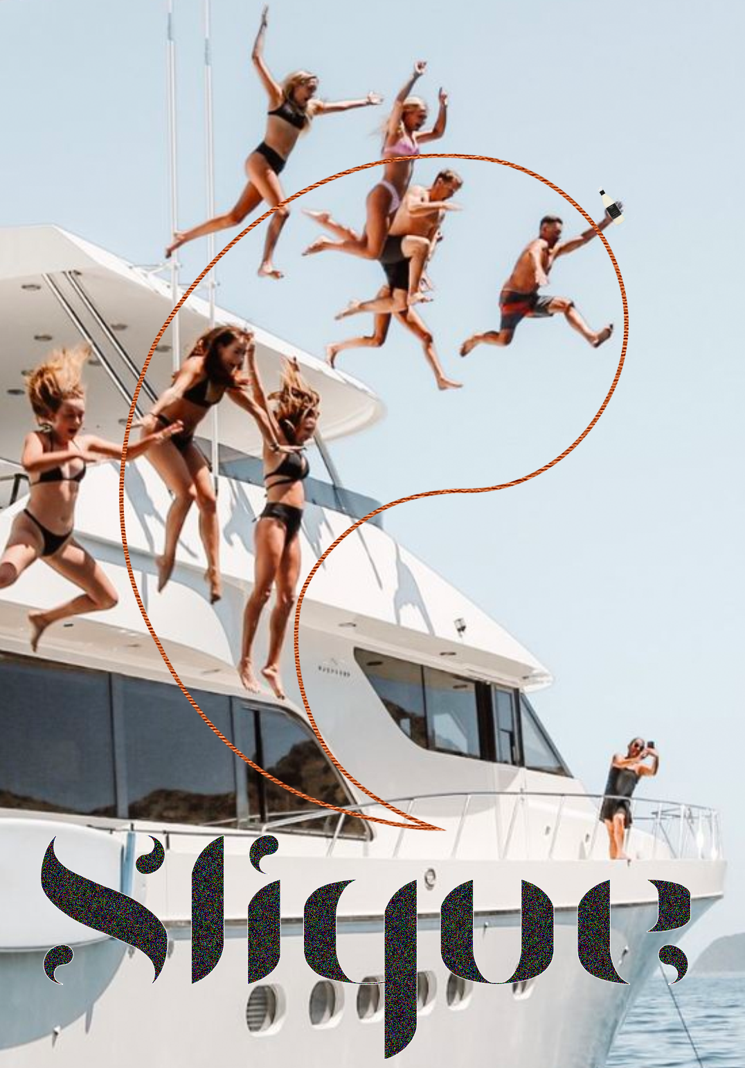
Slique Tequila 〜 Branding, Brand Strategy & Packaging
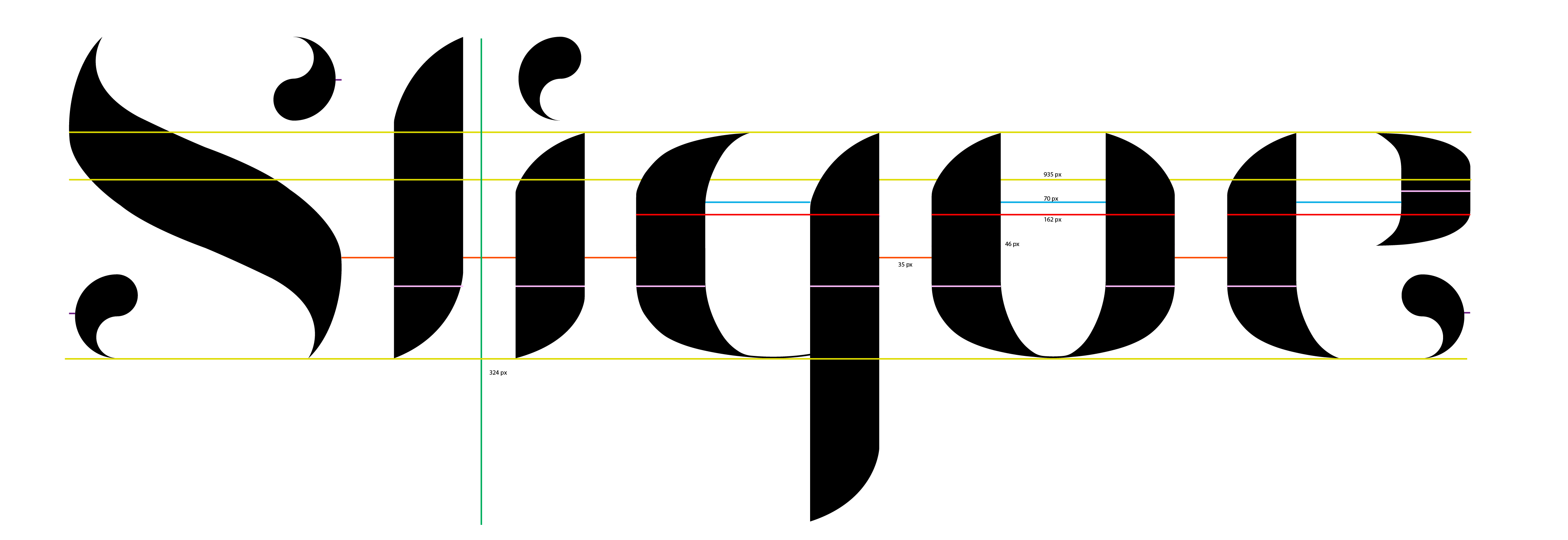
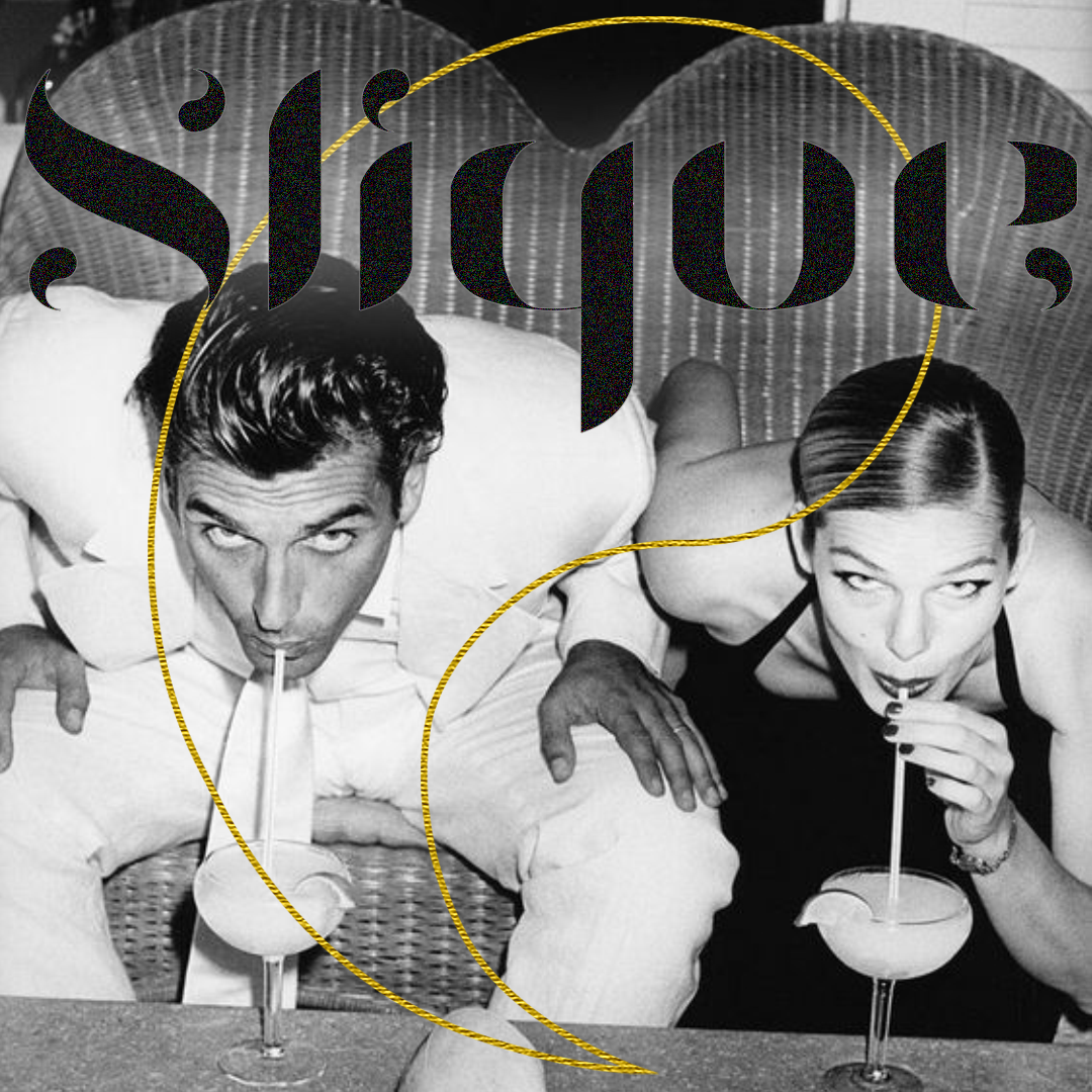
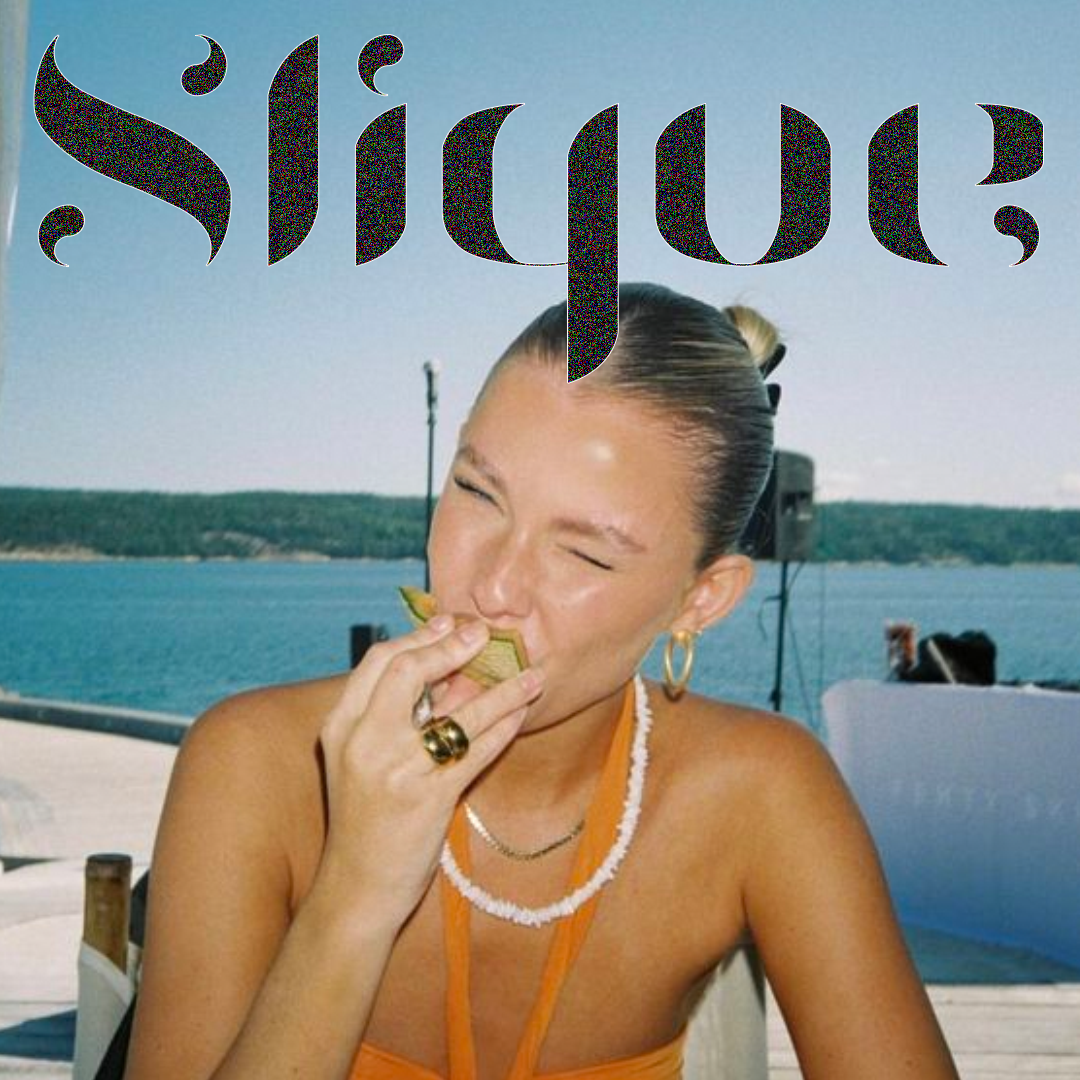
We wanted to appeal to both the younger crowd as well as late 20’s // early 30’s. It was important that SLIQUE had a fashion like quality to it, a logo mark you would wear. The apostrophe logo mark is half a yin yang sign, representative of the balancing between socialising over a few drinks whilst maintaining a healthy lifestyle. It was also important to be unisex, appealing to all genders. The sliver of gold, silver and copper are used to differentiate the unique flavours.
.png)

No items found.